This post talks about the legacy branch, which is deprecated. You should check README for latest usage instruction. Visualization in R part is still valid since it’s mostly unaffected by the VNDB data structure change.
Intro
As I said in WebP to AVIF#Background, here is the post introducing data visualization using ggplot2 package provided by R.
VNDB, is an acronym of VNDB Novel Data Breakup, which is also the abbreviation of Visual Novel DataBase. You know, just like HLTB Linear & Temporal Breakdown.
VNDB the website is the go-to for English VN readers, I suppose. It has awesome search features (e.g. the default query used in VNDB-Calendar en release). I initially started using it as an alternative for ErogameScape (エロゲー批評空間), since it’s really hard to connect to ErogameScape w/o a trustworthy Japanese IP. Later on, I’ve just settled on it as it appears to be the perfect match to me in terms of its open nature:
- Source code available under AGPL-3.0, an alternative form of copyleft
- Open database API, and even a daily updated database dump
- Discussion board in a simplistic style
Back to VNDB the repo, it contains the companion scripts for VNDB List Export for my personal use. Although I started with general applications in mind, I became more interest in visualization using ggplot2 and discarded availability for others in the end.
Packages
Most packages I use are from Tidyverse and the only exception, i.e., corrplot can be replaced with corrr in Tidyverse as well. I just did not take the time to do it again. ggplot2 is obviously the most used one since I’m learning visualization using R. There are some resources I find useful so just keep them here for future reference:
- Official page on Tidyverse, which has a cross reference to the cheatsheet provided by R Studio (albeit their weird renaming to Posit) and more recommendations in Learning ggplot2 section
- Top 50 ggplot2 Visualizations - The Master List (With Full R Code), the name tells everything. I only glance at it and soon get overwhelmed. Wish me good luck next time :)
- ggplot 作图入门, a chapter of R 语言教程 focusing on data visualization provided by Prof. Li Dongfeng from Peking University, obviously in Chinese as you can tell from the chapter name
- (R 可视化) ggplot2 库介绍及其实例, written in Chinese again, but it has a nice explanation on the core concepts and comes with well-rounded cases
- The documentation! CRAN is a good starting point. Take ggplot2 as an example, it has outlinks to bug tracker, documentation, source code, compatibility etc. I recall there are several packages won’t install because the package is only available in tarball but not binary, or the checksum does not match so it gets delisted from CRAN temporarily. All these info can be found there.
- The dataset! Familiarize it before using a package. IMO the greatest thing in R is many packages would provide a built-in dataset to test its features (for example,
ggplot2has adiamondsdataset along with many other), and R installation by itself comes with a lot of dataset already so you don’t need to go hunting on Kaggle most of the time.
So much blah, let’s just get to the point.
Sanitizer
vndb-sanitizer.py shares a fair amount of codes with HLTB Linear & Temporal Breakdown#Sanitizer so I would not explain it again. Also, the split_length function is a bit unnecessary as I realized later that VNDB has a toggle to show length and lengthDP IIRC. It’s definitely possible and probably even easier to implement the same thing in R, again, I just did not have the time, sigh.
Bar Chart Race
Same as above, it’s mentioned in HLTB Linear & Temporal Breakdown#Bar Chart Race. It’s a lot easier this time though, as VNDB has well structured data so I don’t need to manually creating all combinations & filling in the blank. And a label bar chart race would not be of any use I suppose…
Plots
Many plots are drawn based on my erroneous assumption so in fact I just try to use different ways to visualize the data to learn more about R.
Bear in mind that I wrote the followings a few days later than I finished the repo, so chances are the repo README or code comments are more convincing than this post.
Scatter Plot
Let’s start with something basic. I assume everyone knows about linear regression, if not by the definition in theory, one must have used it in real life to predict something so just ignore the buzzword and have a look at the plot.
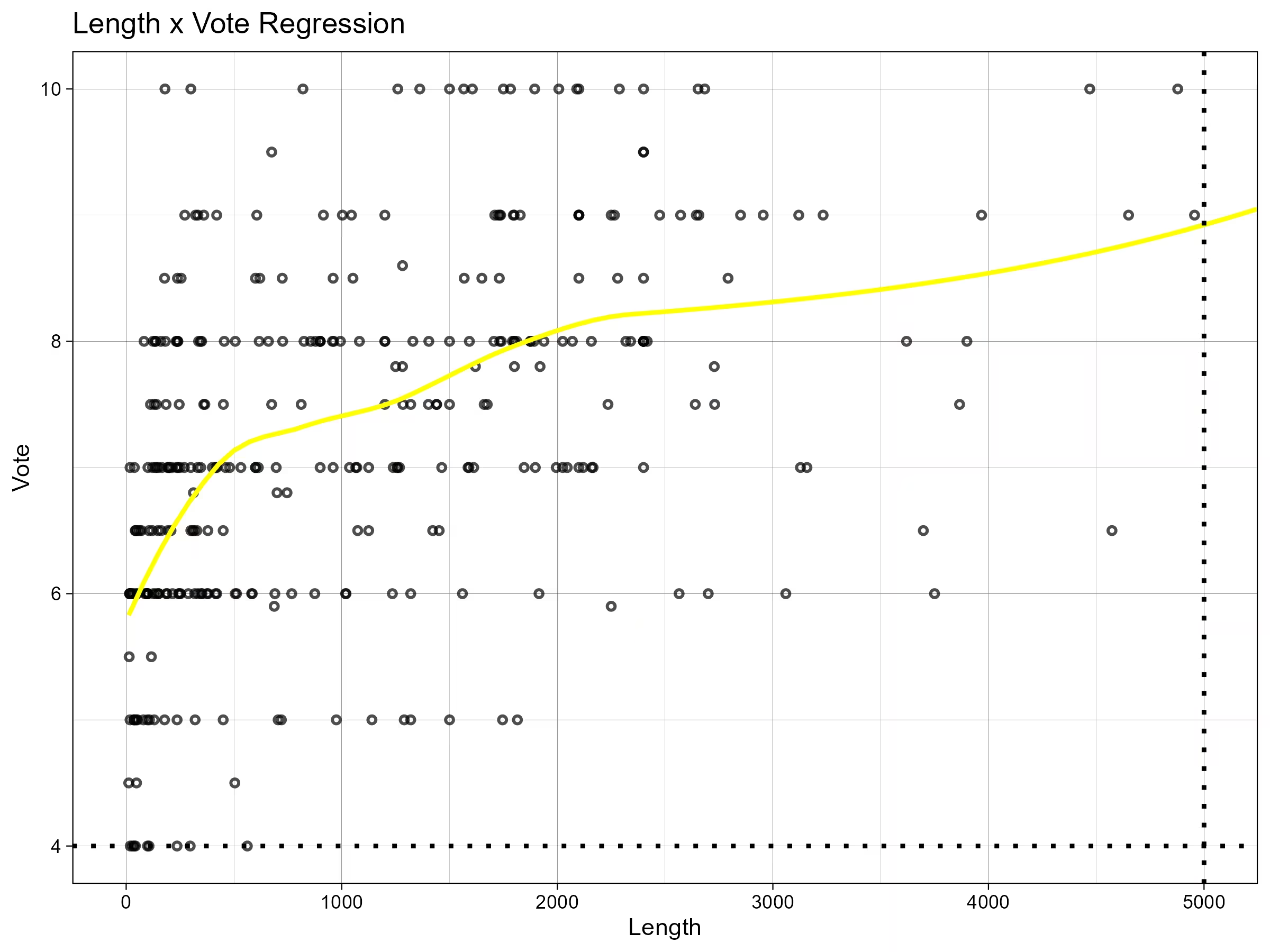
It’s a scatter plot with a fitting curve, showing the possible relation between VNDB (weighted) average length and my personal rating. I thought the longer VN would have a higher score but it just seems…random.
Now I’ll finally show some lines of code. Very straightforward:
# Filter finished VNs w/ real length (instead of guessed one)
# Check "_TO_REPLACE_LEN" in `vndb-sanitizer.py`
filtered_data <- filter(data, Labels == "Finished" & Vote != 0 & LengthDP != -1) # nolint

# Perform linear regression
relation <- lm(Vote ~ TotalMinutes, data = filtered_data)

# Display summary of the linear regression model
print((summary(relation)))
And the block to generate the plot:
vote_length_regression <- function(data) {
  plot <- ggplot(filtered_data, aes(x = TotalMinutes, y = Vote)) + # nolint
    # Add scatter plot points
    geom_point(alpha = 0.7, size = 1.0, shape = 21, stroke = 1) +
    # Add w/o confidence interval
    geom_smooth(method = "auto", se = FALSE, color = "yellow") +
    geom_hline(yintercept = 4, linewidth = 1, linetype = "dotted", color = "black") +
    geom_vline(xintercept = 5000, linewidth = 1, linetype = "dotted", color = "black") +
    labs(title = "Length x Vote Regression", x = "Length", y = "Vote") +
    coord_cartesian(xlim = c(0, 5000), ylim = c(4, 10)) + theme_linedraw()
}
The geom_smooth line is a bit tricky. When I use glm method, the fitting line becomes quite weird and does not match at all. The fitting curve above at least seems more fitted.
geom_hline and geom_vline can generate dotted lines to make the plot more balanced, as most points are in the (upper) left area.
And theme_linedraw makes the plot less colorful and more professional.
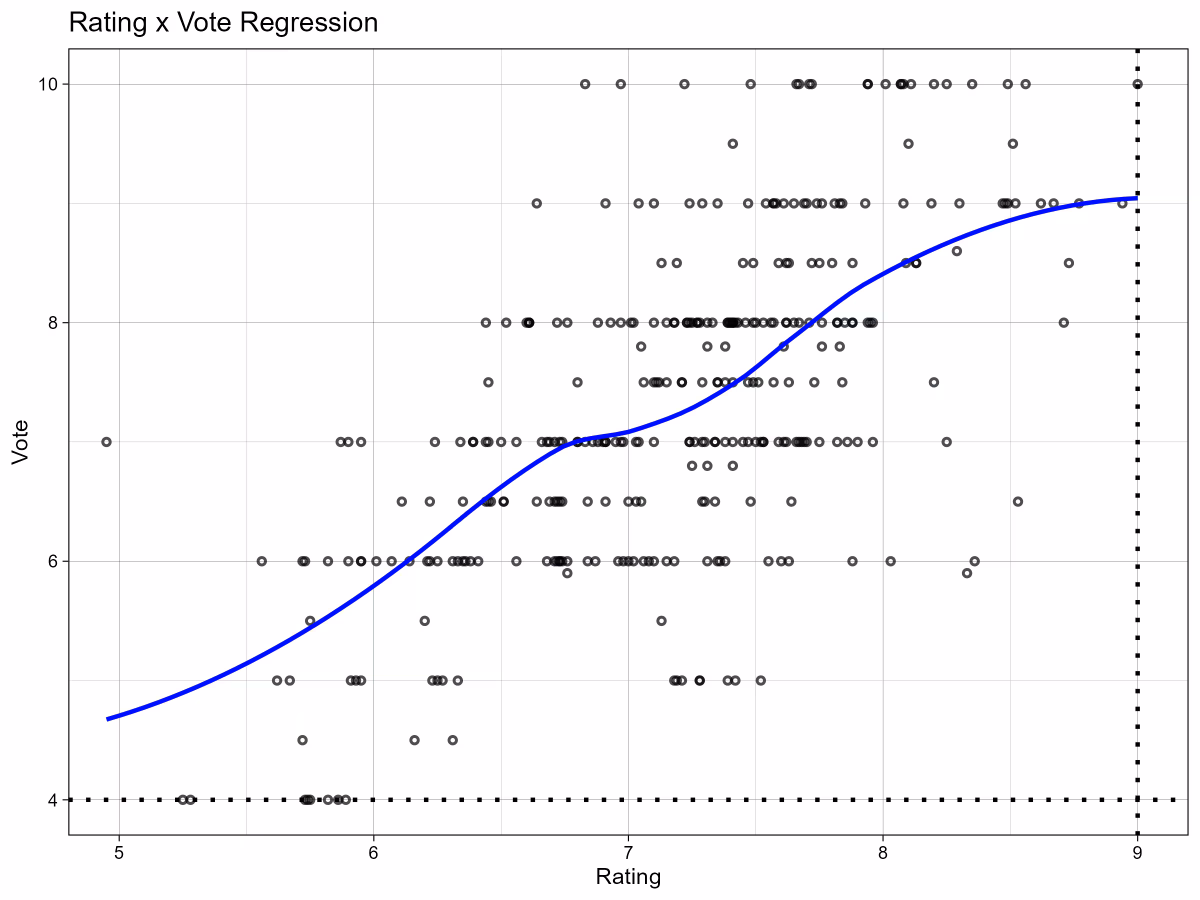
There is also a rating x vote regression which I find more relevant, in the sense of statistics.
Correlation Matrix
I did not expect correlogram (aka. correlation matrix) at first since I only got to know data exploration tools like Rath just one month earlier. However, I happened to notice a similar figure from LMSYS Chatbot Arena Leaderboard via QbitAI when learning R:
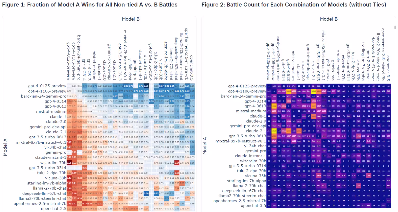 Picture from LMSYS, you can find more about this on their blog.
In case you know none of those buzzword, I’ll elaborate a bit more:
- A correlation matrix is commonly used to distinguish the possible connection between data, as I understand it. Maybe it has other usage too.
- Chatbot Arena is a crowdsourced LLM (Large Language Model) benchmarking platform backed by LMSYS Org (Large Model Systems Organization, founded by students and faculty from UC Berkeley in collaboration with UCSD and CMU)
- QbitAI is a Chinese media covering tech news you probably do not care about
Back to VNDB, my implementation is really ugly as I use corrplot which has a classic style. Anyway results matter most. Dealing with ggplot2 can sometimes be like playing with LaTeX templates. You can easily get the job done within a few minutes, but would continue to do unnecessary improvements on styling for a hour and still feel imperfect about the plot…
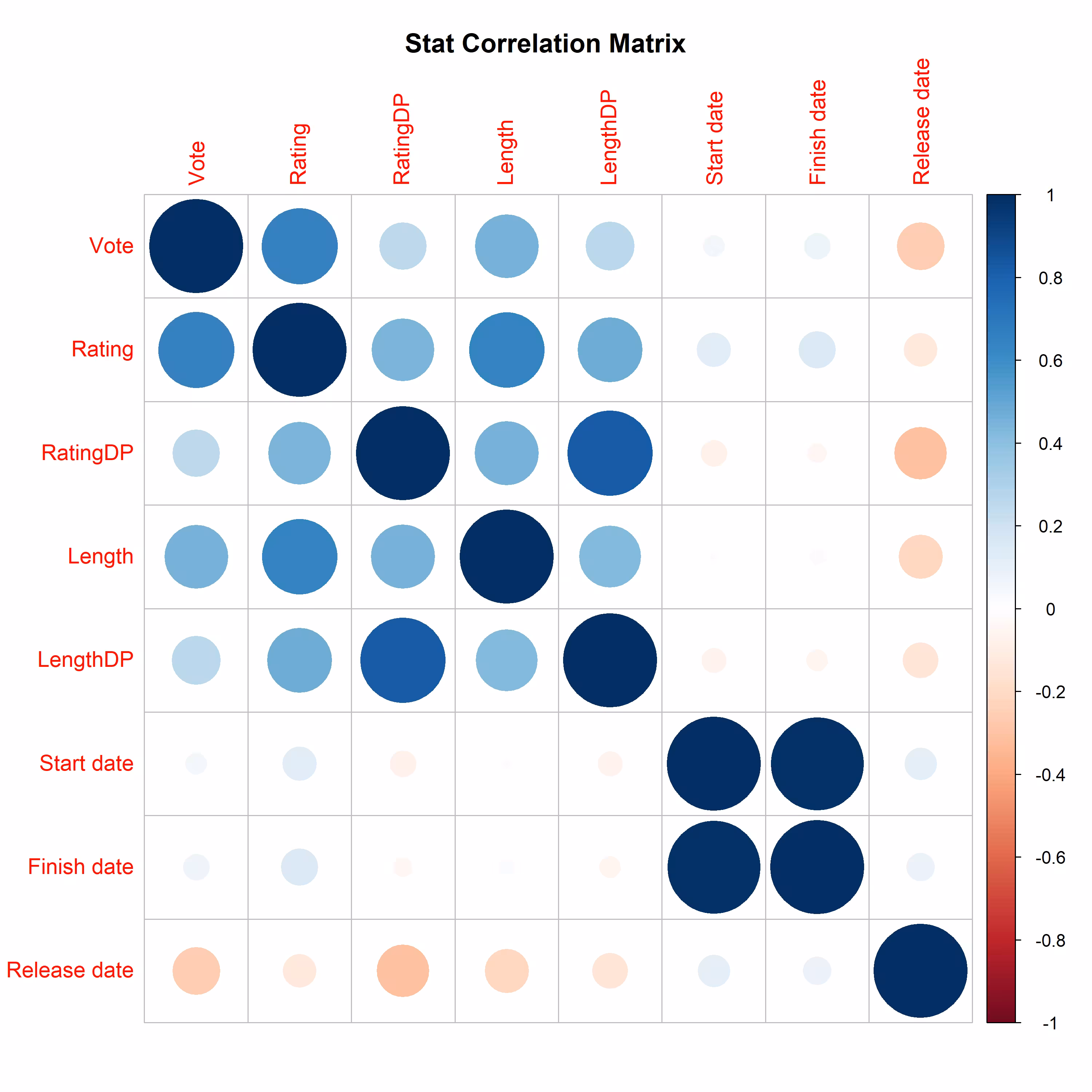
As ggplot2 is not used here, I can’t use ggsave to save the result and end up trying MANY times to get the desirable resolution and not crop the title.
# Generate correlation matrix
png(
  filename = "output/corrplot-stat.png",
  width = 10, height = 10, units = "in", res = 300
)
# Set resolution
par(mar = c(1, 1, 1, 1), mfrow = c(1, 1), cex = 1.2, pin = c(5, 5))
corrplot(cor_matrix, method = "circle")
# Move down title so it would not be trimmed
title("Stat Correlation Matrix", line = -1)
dev.off()
Histogram and Polar Coordinates
Tbh I’m not very sure whether this is called polar coordinates🤔:
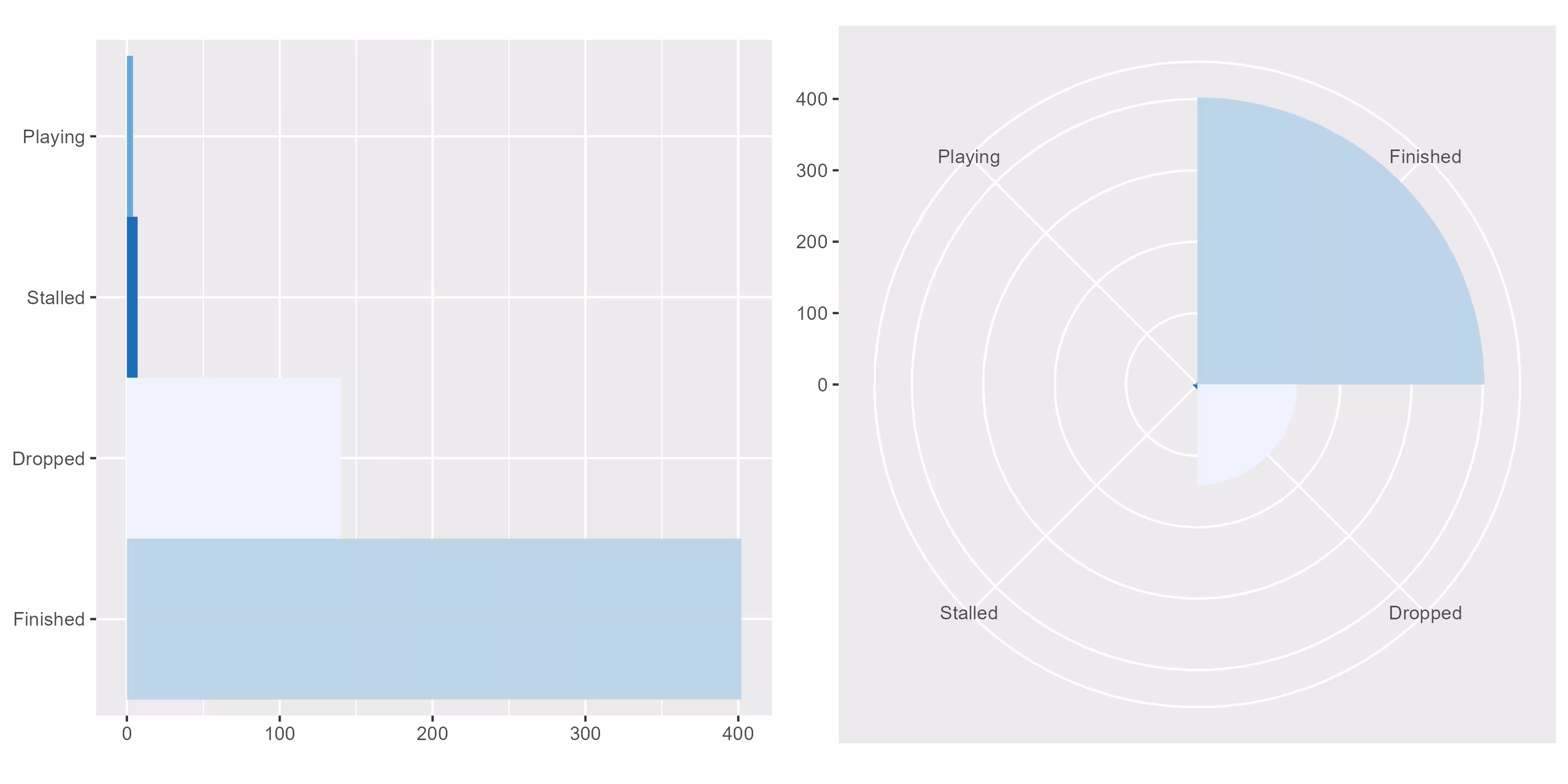
I wish to replicate the vote statistics chart on VNDB in the beginning but result in a very different plot. And it’s not very good looking as I use Labels as input. Vote should be better but I do not have the patience on that day to do chores like rounding up votes or whatever even if it’s literally 2-5 lines of code.
Initially I made the function supports multiple inputs, but discovered later on that each validates a special case and just gave up since I’ve known how to do it, probably soon™.
What I learnt from this besides polar bar is the usage of gridExtra, which is one of the many ubiquitous that make visualization with R awesome:
# Flip x and y
bar1 <- bar + coord_flip()
# Polar
bar2 <- bar + coord_polar()
plots <- list(bar1, bar2)

filename <- paste("output/", label_str, "-bar.png", sep = "")
ggsave(filename,
  gridExtra::grid.arrange(grobs = plots, ncol = 2),
  width = 10, height = 5, units = "in", dpi = 300
)
Heatmap
Only starting from this plot, I’ve gathered the slightest confidence to state that I know something about visualization in R.
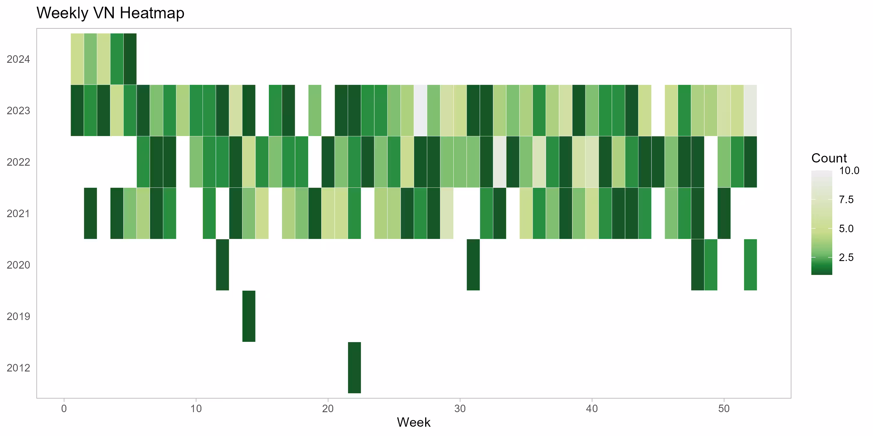
At least not ugly, right? Actually, no. It’s not ugly because I accidentally mark 10+ VN/w as blank and smaller becomes greener in what I call reverted GitHub style.
If this error is corrected, the heatmap would look like this:
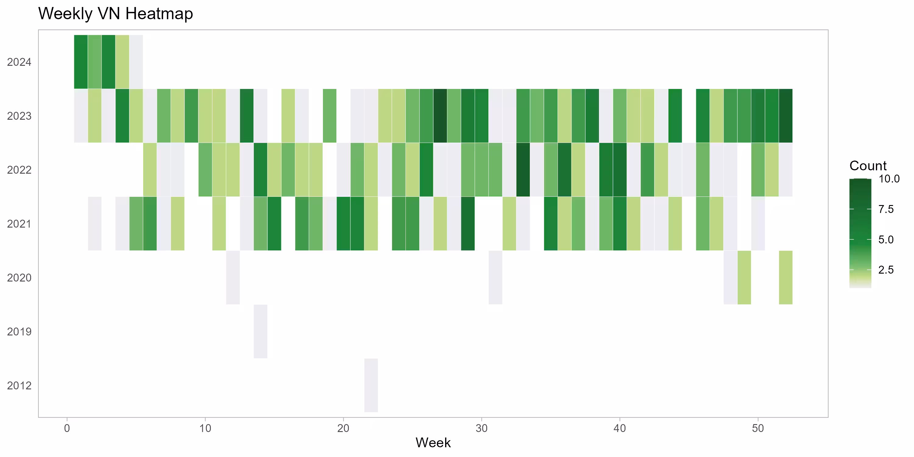
Never mind. IMO the difficult part of this plot is that data is grouped by year and counted week by week (i.e. grouped by week). It’s still rather easy if you have mathematical thinking.
I can’t recall if I use lubridate to deal with date. Given that the annoying lintr does not have an unused import warning, I guess it’s used somewhere. A cheatsheet is also available in rstudio/cheatsheets repo.
The idea is quite simple. I just happen to have some inspiration before it occurs to me. There is also a sticky NA label in y axle that took me some time to solve. Other things are mainly styling stuff.
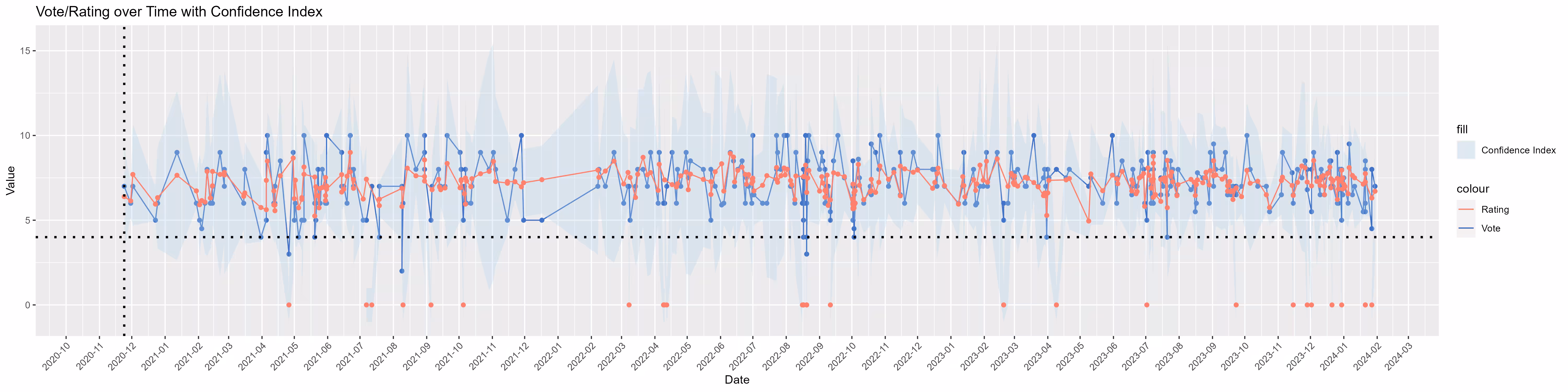
Temporal Stats, and Ranking Theories
To end this section, temporal stats plot seems like a good farewell.
Issues
That being said, the function used has many issues:
- Data is sorted mainly using
Start date, I’d prefer aRelease dateplot which seems quite easy. I just did not have the time (again). - Labels are a bit confusing. Even myself have to look at the code to find out what’s my personal rating/vote…
- My Confidence Index (not confused with a similar concept namely Confidence Interval aka. CI) is weird. I’ll say a lot more about this later.
- Data filtering only partially works. Very early stat like 2010s is indeed excluded, but
date_breaksor whatever does not want2020-10to disappear:
# Vertical starting line
geom_vline(
    xintercept = as.numeric(as.Date("2020-11-24")),
    linewidth = 1, linetype = "dotted", color = "black"
) +
scale_x_date(
    # Ignore data before a certain date
    limits = as.Date(c("2020-11-01", max(data$`Start date`))),
    # Grouped by month
    date_breaks = "1 month", date_labels = "%Y-%m"
) +
- Naturally, VNDB would not show VN rating if there are not enough votes, and these would be interpreted as
NA. And I don’t always vote VNs myself so in some VNs my personal vote becomesNAtoo. While I manage to hideNAin personal vote and still show average rating, the problem is, if average rating is zero, the respective point on my personal vote line is not connected as well. This is unexpected and I’m tired after fiddling with it for a while.
Ranking Theories
I ran into text version of “牛子精灵”和“猫猫”泛滥,Steam 评测系统真的科学吗? (video version available at BiliBili and YouTube) a few days ago. Although the article itself was hardly well written, it introduced a few ranking theories that caught my interest:
- An Empirical Study of Game Reviews on the Steam Platform
- Coleman Liau Readability Index (I find the CLI index a bit controversial)
- How Not To Sort By Average Rating
- TL;DR: Score = Lower bound of Wilson score confidence interval for a Bernoulli parameter
- Math Time | Using Laplace Smoothing for Smarter Review Systems (And Other Stuff)
- Similar as above, but use Laplace smoothing instead
- How To Sort By Average Rating
- The idea is simple. As I no longer understand my note, no comment on this🤦 IIRC SteamDB uses a ranking method inspired by this
Confidence Index
Used to evaluate the level/degree of confidence about average rating, in natural language, used to draw the ribbon of Rating line based on RatingDP.
Procedure:
RatingDPmeans the number of votes on a specific VN (could beNA/0). We assume higherRatingDPhas higher level of confidence- Find the lowest and highest count of
RatingDPP(e.g.0and20000, divide the interval into several exponentially growing small intervals (such as 0-32, 33-128, 129-496 and so on), record the interval in which each row ofRatingDPis located and the base of the corresponding index - The upper and lower limits of ribbon are
Relevant R code:
# Calculate vote "confidence index"
# Based on dumb average & MY faulty assumption
data <- data %>%
  mutate(
    confidence_index = cut(RatingDP,
      # Break data into several groups
      breaks = c(0, 32, 128, 500, 1200, 3000, 6000, 20000),
      include.lowest = TRUE
    ),
    # Use the exponent of e as base
    Base = exp(1)^as.numeric(confidence_index),
    # Define limits
    ymin = Rating - log(Base),
    ymax = Rating + log(Base)
  )
Now we just need to draw the ribbon with some transparency. It took me a while to figure out the proper alpha value and realize that I need aes stats first to construct aesthetic mappings:
# Add confidence index (NOT that CI aka. confidence intervals)
geom_ribbon(
  data = data, aes(
    x = `Start date`,
    ymin = ymin, ymax = ymax,
    fill = "Confidence Index"
  ),
  alpha = 0.3
) +
This is fairly naive, I know. It’s just a very little experiment to test the theory myself.
Besides those #Issues I mentioned above, I would probably improve it by setting only upper or lower limit if VNDB average Rating is larger/smaller than my personal vote. For now the ribbon would be really extreme if RatingDP is too large (which results in a larger log(Base)).
Also, it does not reflect my preference (i.e. not considering Vote as a variable). If I give a highly acclaimed VN low vote like Utawarerumono: Mask of Deception (うたわれるもの 偽りの仮面) and Majikoi! Love Me Seriously!! (真剣で私に恋しなさい!), and the contrary like Comic Party (こみっくパーティー), I want it shown apparently.
More Ranking Theories
It occurs to me that VNDB uses an algorithm called Bayesian Personalized Ranking (abbr. BPR) a few days after I implemented Confidence Index. So I whoogled it and read a few related papers and real life implementation like IMDB. Random resources I referred to:
Confidence Index Revisited
Although I was studying BPR theories, what I want to do is in fact average estimation curve based on an extension of Laplace smoothing I mentioned in #Ranking Theories:
TotalDPis simply a sum ofDP,TotalScoreis the weighted total score (which means nothing)TotalAvg= weighted average = 1 / index = n / (n * index) ( I mentioned above)- Finally draw the
NewRatingcurve (compare it w/ VNDB Bayesian Rating?)
I have not implemented it as I still don’t think it’s accurate enough. However, the theoretical work is done for now.
Postscript
There are many more things I wish to do but do not have the time in R. And I’m kind of awkward when I find out that VNStat seems to provide similar function already, although I never manage to visit the site as it just loads forever in my browser.
You can find all the scripts in VNDB the repo. Learning R and writing this post really takes me a lot of time so I would not expect a similar experience any time soon. However, the journey (note the reference to description) of ggplot2, tidyverse and R in general makes me again become enthusiastic about programming and future, so far so good.