Intro
Here is the accompanied side post about visualizing my HLTB stats in 游戏报告 series, which would appear later in 2024 年度总结 - 游戏篇#时长.
The code is mostly generated by DeepSeek-V3 (I’ll just quote it as DeepSeek below), but it definitely won’t get this far without me. Yes, I’m important :) I’m just too lazy to look up all the functions/methods in the docs. In this regard, DeepSeek does a great job. With different options given, I can choose whichever I prefer.
I’ll assume you have some basic knowledge in R and ggplot2 in this post. If not, you can read VNDB Novel Data Breakup for a random bootstrap. Format like limit means it’s variable, tag, or things like that. Similarly, with () in scale_y_continuous(), it’s a function.
Data
First, let’s inspect the data. I manually copied them as TSV and (pointlessly) converted it into CSV.
Lastmod,Playing,Backlogs,Replays,Stalled,Completed,Retired
2023-12-31,6,519,18,27,2538,401
2024-02-01,8,540,21,29,2583,413
2024-03-05,6,555,21,29,2614,423
Quite neat, Lastmod is ISO date and all others are pure integers. Let’s just import and have a glance at the plot.
Prompt
The prompt (and translation):
R ggplot2,从1.csv读取数据,绘制2024年各项的走势,折线图,按照月份分割,突出数据点,点之间的连线使用80%不透明度

R ggplot2, read data from 1.csv, draw line chart, divided by month, make data point stand out, lines are in 80% alpha
DeepSeek gave me this along with explanation:
library(ggplot2)
library(readr)

data <- read_csv("1.csv")
print(data)

# Convert data type
data$Lastmod <- as.Date(data$Lastmod)
# Pick Y/M
data$Year <- format(data$Lastmod, "%Y")
data$Month <- format(data$Lastmod, "%m")
# Filter out data in 2024
data_2024 <- subset(data, Year == "2024")
print(data_2024)

# Draw lines
ggplot(data_2024, aes(x = Lastmod)) +
  geom_line(aes(y = Playing, color = "Playing"), alpha = 0.8) +
  geom_line(aes(y = Backlogs, color = "Backlogs"), alpha = 0.8) +
  geom_line(aes(y = Replays, color = "Replays"), alpha = 0.8) +
  geom_line(aes(y = Stalled, color = "Stalled"), alpha = 0.8) +
  geom_line(aes(y = Completed, color = "Completed"), alpha = 0.8) +
  geom_line(aes(y = Retired, color = "Retired"), alpha = 0.8) +
  geom_point(aes(y = Playing, color = "Playing")) +
  geom_point(aes(y = Backlogs, color = "Backlogs")) +
  geom_point(aes(y = Replays, color = "Replays")) +
  geom_point(aes(y = Stalled, color = "Stalled")) +
  geom_point(aes(y = Completed, color = "Completed")) +
  geom_point(aes(y = Retired, color = "Retired")) +
  scale_color_manual(values = c("Playing" = "blue", "Backlogs" = "red", "Replays" = "green",
                                "Stalled" = "purple", "Completed" = "orange", "Retired" = "brown")) +
  labs(title = "2024 HLTB 走势图", x = "日期", y = "数量", color = "项目") +
  theme_minimal() +
  theme(axis.text.x = element_text(angle = 45, hjust = 1))
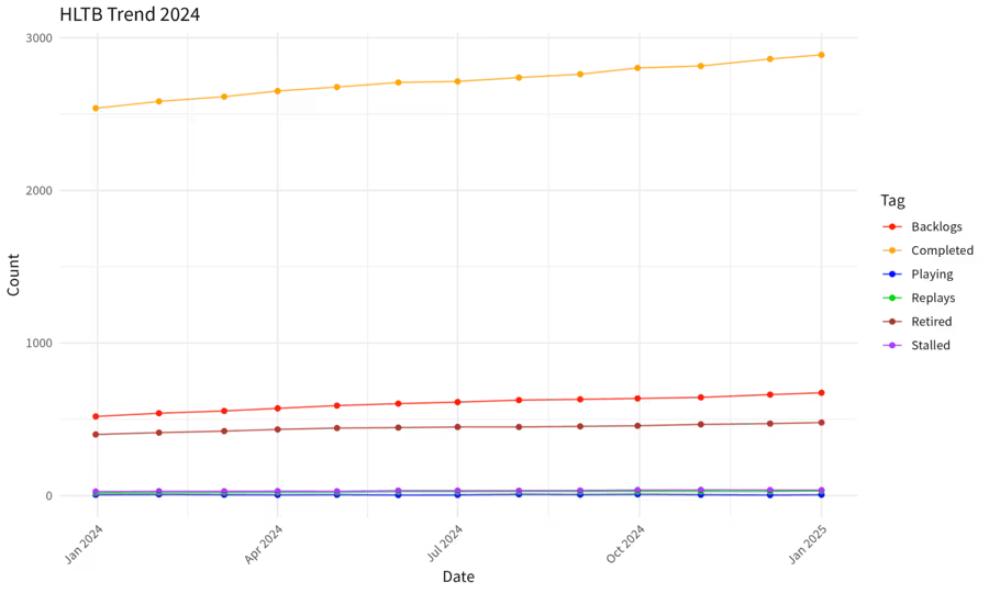
Hell no, those goem_line are ugly. Also, 2023-12-31 is almost 2024. I don’t want to filter out it.
col_types
We ultimately know other columns are just integer, so convert data type with col_types when importing. Now silly DeepSeek gave me this:
data <- read_csv("1.csv", col_types = cols(
  Lastmod = col_date(format = "%Y-%m-%d"),
  Playing = col_integer(),
  Backlogs = col_integer(),
  Replays = col_integer(),
  Stalled = col_integer(),
  Completed = col_integer(),
  Retired = col_integer()
))
Good news is I noticed there is a .default setting, so import it in the cool way:
data <- read_csv("1.csv", col_types = cols(
  Lastmod = col_date(format = "%Y-%m-%d"),
  .default = col_integer() # cool import
))
CJK
It occurs to me that Python has yield expressions, a cool way to define generator. Let’s ask DeepSeek about this. Before talking about solutions, now the code won’t run:
1: In grid.Call.graphics(C_text, as.graphicsAnnot(x$label), x$x, x$y, :

 conversion failure on '日期' in 'mbcsToSbcs': for 日 (U+65E5)
What’s your problem? Ask DeepSeek, and it tells me to import showtext package and use simhei.ttf that does not exist on my Void Linux (or set family to fonts with Chinese support in theme), as CJK (or non ASCII) character support sucks everywhere. I don’t do that here, just change the labels to English instead.
pivot_longer
Now go back to simplify this nightmare:
ggplot(data_2024, aes(x = Lastmod)) +
  geom_line(aes(y = Playing, color = "Playing"), alpha = 0.8) +
  geom_line(aes(y = Backlogs, color = "Backlogs"), alpha = 0.8) +
  geom_line(aes(y = Replays, color = "Replays"), alpha = 0.8) +
  geom_line(aes(y = Stalled, color = "Stalled"), alpha = 0.8) +
  geom_line(aes(y = Completed, color = "Completed"), alpha = 0.8) +
  geom_line(aes(y = Retired, color = "Retired"), alpha = 0.8) +
  geom_point(aes(y = Playing, color = "Playing")) +
  geom_point(aes(y = Backlogs, color = "Backlogs")) +
  geom_point(aes(y = Replays, color = "Replays")) +
  geom_point(aes(y = Stalled, color = "Stalled")) +
  geom_point(aes(y = Completed, color = "Completed")) +
  geom_point(aes(y = Retired, color = "Retired")) +
  scale_color_manual(values = c("Playing" = "blue", "Backlogs" = "red", "Replays" = "green",
                                "Stalled" = "purple", "Completed" = "orange", "Retired" = "brown")) +
  labs(title = "HLTB Trend 2024", x = "Date", y = "Count", color = "Tag") +
  theme_minimal() +
  theme(axis.text.x = element_text(angle = 45, hjust = 1))
Two options in my mind:
- pivot_longer in tidyr, which is available in tidyverse
- Use facet_wrap() or facet_grid() to have individual charts
Option 1 is preferred here as that’s the whole point… Now we have this (lintr is annoying yet quite useful at the same time btw):
library(ggplot2)
library(readr)
library(tidyr) # pivot_longer

data <- read_csv("1.csv", col_types = cols(
  Lastmod = col_date(format = "%Y-%m-%d"),
  .default = col_integer() # cool import
))

# simplify data to avoid redundant lines
data_long <- data %>%
  pivot_longer(cols = -Lastmod, names_to = "Tag", values_to = "Count")

ggplot(data_long, aes(x = Lastmod, y = Count, color = Tag)) +
  geom_line(alpha = 0.8) +
  geom_point() +
  scale_color_manual(values = c(
    "Playing" = "blue", "Backlogs" = "red", "Replays" = "green",
    "Stalled" = "purple", "Completed" = "orange", "Retired" = "brown"
  )) +
  labs(title = "HLTB Trend 2024", x = "Date", y = "Count", color = "Tag") +
  theme_minimal() +
  theme(axis.text.x = element_text(angle = 45, hjust = 1))
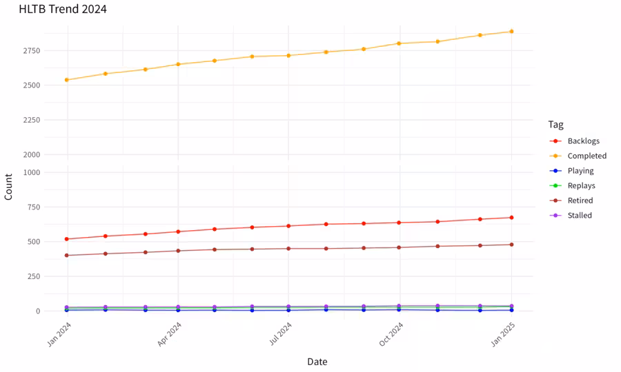
And first ugly preview with ggsave (if you use dark mode, open in new window):
Color
Now that it’s barely working, it’s time for some styling stuff!
First, HLTB has its own color scheme, let’s follow that.
Just open Games tab in a user profile, inspect a tag, and pick background-color on hover in CSS.
Now we have this:
scale_color_manual(values = c(
    "Playing" = "#2f933a", "Backlogs" = "#2b7ab9", "Replays" = "#439de3",
    "Stalled" = "#1b7168", "Completed" = "#934b93", "Retired" = "#cb3a3b"
  )) + # HLTB style
Break
All above are just simple tasks you can do within a few minutes. Now comes the tricky ones.
Take a closer look at the preview image above, you’ll notice the huge gap between tags:
Backlogs/Retiredends below 1000 whileCompletedstarts at 2000+- Other lines are barely seen as they are actually below…50
Now let me ask DeepSeek how to ignore count between 1000 and 2000 in y axis, and it shows me not two, but four solutions:
limitvariable in scale_y_continuous() function, which would excludeCompleted, so no- log trans, well, I’m not a calculator, and I can’t even remember π or e for 30+ digits, let alone lg or ln, still no
- facet_wrap() or facet_grid(), mentioned in #pivot_longer, then charts are separated, not even better
- double y axis, which ggplot2 does not support, but can be done in a tricky way
scale_y_continuous(limits = c(0, 1000)) + # limit y axis
scale_y_continuous(trans = "log10") +  # log
facet_wrap(~ Tag, scales = "free_y") +  # individual chart
# second y axis
scale_y_continuous(
    limits = c(0, 1000),
    sec.axis = sec_axis(~ . * 2, name = "High Count")
) +
Option 4 seems to be the most promising one, although dual y axis is confusing. Again, I ask DeepSeek to elaborate more on this and whether I can just truncate y axis between 1000 and 2000. Okay, another array of solutions:
- scale_y_continuous() and coord_cartesian(), noooo
- manually set data above 1000 as NA, no…
- ggbreak package
At first I doubt if I’ll need yet another package as I’m lazy, so ask again for similar packages in tidyverse. Still three options:
- ggbreak
- manually set data between 1000 and 2000 as NA…
- trans_new() in scales package
Ok, so I decide to install ggbreak and give it a try:
library(ggplot2)
library(readr)
library(tidyr) # pivot_longer
library(ggbreak) # data break point
data <- read_csv("1.csv", col_types = cols(
Lastmod = col_date(format = "%Y-%m-%d"),
.default = col_integer() # cool import
))
# simplify data to avoid redundant lines
data_long <- data %>%
pivot_longer(cols = -Lastmod, names_to = "Tag", values_to = "Count")
p <- ggplot(data_long, aes(x = Lastmod, y = Count, color = Tag)) +
geom_line(alpha = 0.8) +
geom_point() +
scale_color_manual(values = c(
"Playing" = "blue", "Backlogs" = "red", "Replays" = "green",
"Stalled" = "purple", "Completed" = "orange", "Retired" = "brown"
)) +
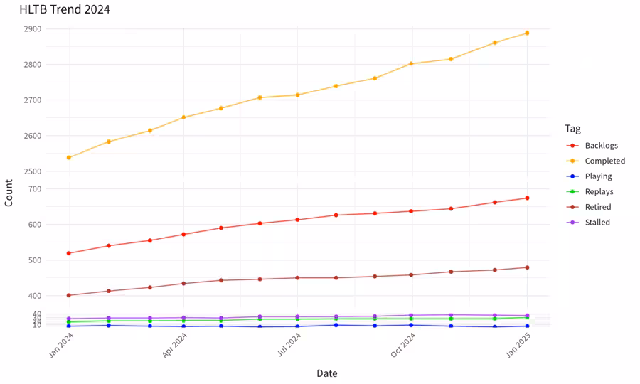
scale_y_break(c(1000, 2000)) +
labs(title = "HLTB Trend 2024", x = "Date", y = "Count", color = "Tag") +
theme_minimal() +
theme(axis.text.x = element_text(angle = 45, hjust = 1))
ggsave("hltb-ggplot2-p2.png", plot = p, width = 10, height = 6, dpi = 300)
Notice the gap between 1000 and 2000 in y axis? That’s exactly what I want! Now open visidata, explore the data a bit to find the perfect threshold, and ask whether we can have multiple breaks (spoiler: yes, as long as they don’t overlap).
Through trials and error, we are almost there:
scale_y_break(c(40, 380)) + # skip gap in y axis
scale_y_break(c(700, 2500)) +
Trans
The final step is to make a transformation, so Completed does not occupy so much space while smaller ones are squeezed together.
Still many options, I’m tired of writing so here is my attempt history:
- scale_y_continuous() by scales package, good
- scale_y_break() and
expandvariable by ggbreak, so-so - compact 2000+ as 1/5 value -> multiply <50 tag as 5x value
End
At the long last we have this:
hltb-stats.r
library(ggplot2)
library(readr)
library(tidyr) # pivot_longer
library(ggbreak) # data break point
library(scales) # custom trans

data <- read_csv("1.csv", col_types = cols(
  Lastmod = col_date(format = "%Y-%m-%d"),
  .default = col_integer() # cool import
))

# use custom trans to multiply DP 50- to 5x
# as DP 2000+ occpies too much space in y axis
custom_trans <- trans_new(
  name = "custom",
  transform = function(x) ifelse(x < 50, x * 5, x), # if 50-, 5x
  # "Retired" starts at 400, so we are safe here
  inverse = function(x) ifelse(x < 250, x / 5, x) # if 250-, 1/5
)

# simplify data to avoid redundant lines
data_long <- data %>%
  pivot_longer(cols = -Lastmod, names_to = "Tag", values_to = "Count")

p <- ggplot(data_long, aes(x = Lastmod, y = Count, color = Tag)) +
  geom_line(alpha = 0.8) +
  geom_point() +
  scale_color_manual(values = c(
    "Playing" = "#2f933a", "Backlogs" = "#2b7ab9", "Replays" = "#439de3",
    "Stalled" = "#1b7168", "Completed" = "#934b93", "Retired" = "#cb3a3b"
  )) + # HLTB style
  scale_y_continuous(trans = custom_trans) + # apply custom trans
  scale_y_break(c(40, 380)) + # skip gap in y axis
  scale_y_break(c(700, 2500)) +
  labs(title = "HLTB Trend 2024", x = "Date", y = "Count", color = "Tag") +
  theme_minimal() +
  theme(axis.text.x = element_text(angle = 45, hjust = 1))

ggsave("hltb-trend-2024.png", plot = p, width = 10, height = 6, dpi = 300)
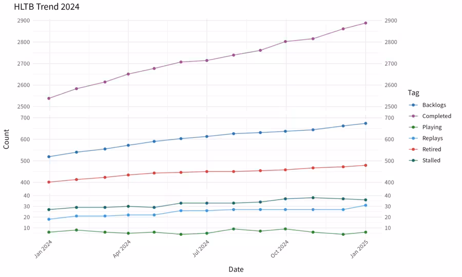
ggplot2 and ggbreak are awesome! Q.E.D.